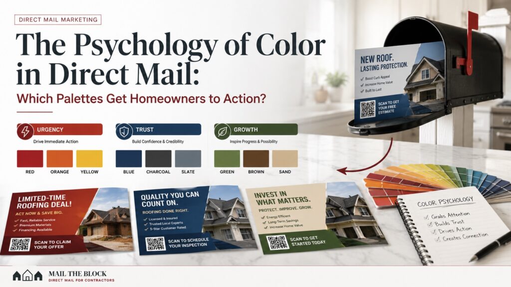
The best colors for direct mail postcards depend on the service, urgency level, and homeowner emotion. Red, orange, and yellow work well for emergency services when used sparingly. Deep blue, charcoal, and slate support trust for premium contractors. Forest green, earthy brown, and warm sand fit landscaping and outdoor property services. The strongest CTA should use one contrasting accent color so the phone number or QR code stands out.
2026 Direct Mail Color Conversion Matrix
| Color Palette | Best For | Homeowner Signal | Best CTA Accent |
|---|---|---|---|
| Red, orange, yellow | Emergency plumbing, HVAC, storm repair | Urgency, action, heat, alert | White or black CTA box |
| Deep blue, charcoal, slate | Remodeling, roofing, electrical, high-ticket upgrades | Trust, stability, professionalism | Bright white or warm gold |
| Forest green, brown, sand | Landscaping, lawn care, tree work, hardscaping | Growth, renewal, natural fit | Cream, yellow, or burgundy |
| Black, white, burgundy | Premium services and luxury offers | Sophistication, control, confidence | Burgundy or gold |
| Clean neutral with one bold accent | Any direct-response campaign | Clarity and focus | Highest contrast color on card |
The 2-Second Visual Sift: How Color Stops the Mailbox Walk To the Trash
Homeowners process a postcard before they read it. Color, contrast, and layout create the first impression during the quick mailbox sort.
A cluttered neon card can feel loud, cheap, and disposable. Too many colors compete for attention, which makes the homeowner work harder to understand the message. That is clutter fatigue.
A better direct mail postcard design uses a controlled palette. The main brand colors should create trust and recognition. The accent color should guide the eye to the headline, phone number, QR code, or offer.
Mail The Block’s EDDM service helps contractors reach selected neighborhoods, but the postcard still needs to win attention once it lands in the mailbox. Color is one of the fastest ways to do that.
Industry-Specific Palettes: Matching Color to Consumer Pain Points
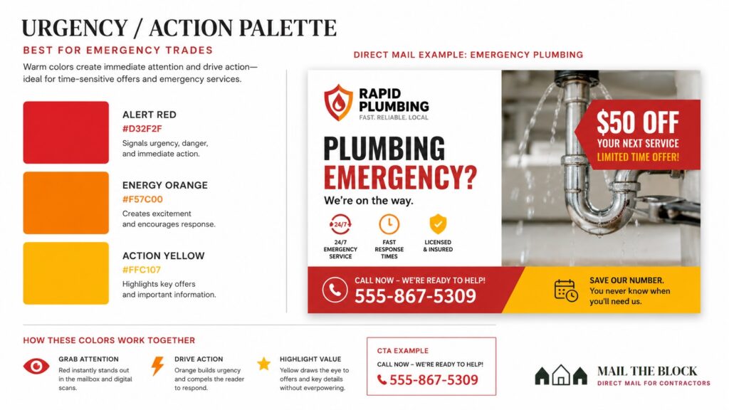
The Urgency and Action Palette
Red, orange, and yellow work best when the homeowner needs to act quickly. These warm tones fit emergency plumbing, HVAC breakdowns, storm damage restoration, roof leaks, drain backups, and urgent repair offers.
Use them carefully. A red CTA button can work. A full red card with flashing-style graphics can make the brand look desperate.
Best use cases:
- “Emergency service available”
- “Storm inspection slots now open”
- “Book before the next freeze”
- “Call now for same-week repair”
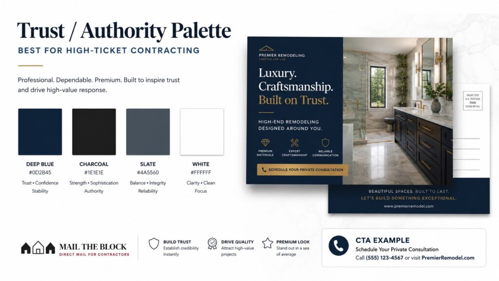
The Trust and Authority Palette
Deep blue, charcoal, slate, white, and muted metallic accents fit high-ticket services. These colors feel stable and professional, which is valuable when the homeowner is considering a roof replacement, whole-house remodeling project, electrical upgrade, premium painting project, or HVAC system replacement.
This palette works because it does not scream. It reassures.
Best use cases:
- Luxury remodeling postcards
- Premium roofing campaigns
- Whole-home electrical upgrades
- High-end painting and cabinet refinishing
- Maintenance agreement offers
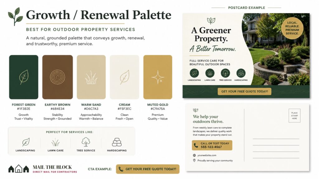
The Growth and Renewal Palette
Forest green, earthy brown, warm sand, cream, and muted gold are strong for outdoor property services. These colors mirror the service itself, which helps the postcard feel natural before the reader studies the offer.
Use this palette for landscaping, lawn care, tree services, hardscaping, mulch delivery, garden upgrades, spring cleanups, and drainage projects.
Best use cases:
- “Spring cleanup routes are opening”
- “Refresh your outdoor living space”
- “Protect your lawn before summer heat”
- “Book your neighborhood mulch installation”
For layout examples and postcard strategy, see Mail The Block’s direct mail postcards and campaign examples.
The Isolation Effect: Using Contrast to Force QR Code and Phone Scans
The strongest postcard designs do not make every element loud. They make one element impossible to miss.
A practical rule: keep 80% of the card inside a clean, unified palette, then reserve one contrasting color for the CTA block.
Examples:
- A deep blue remodeling card with a warm gold “Schedule Consultation” button
- A forest green landscaping card with a cream CTA box
- A white and charcoal roofing card with one burgundy phone number panel
- A red emergency plumbing card with a black or white CTA block
The CTA should be the visual destination. The reader should move from headline to proof to action without searching.
A strong CTA area should include:
- Phone number
- QR code
- Short action phrase
- Clear offer
- Enough white space around the scan area
Call to Action Placement Matters More Than Decoration
Color cannot save a weak CTA. A bright button with vague wording still underperforms.
Use action-based CTA language:
- Scan to schedule your inspection
- Call to reserve your service window
- Book your maintenance visit
- Request your neighborhood estimate
- Claim your priority scheduling slot
The CTA color should contrast with the card background, but it should still match the brand tone. Premium brands should avoid cheap starbursts unless the offer truly belongs in a discount-driven campaign.
Launch a High-Conversion Direct Mail Campaign
A postcard color palette is not just an aesthetic choice. It is the invisible force that either commands attention at the doorstep or sends the message into the recycling bin.
Mail The Block pairs direct-response visual strategy with neighborhood targeting, postcard design, EDDM setup, and print production for home service contractors. Review pricing or contact Mail The Block to launch a high-conversion direct mail campaign built around stronger color, cleaner contrast, and clearer action.