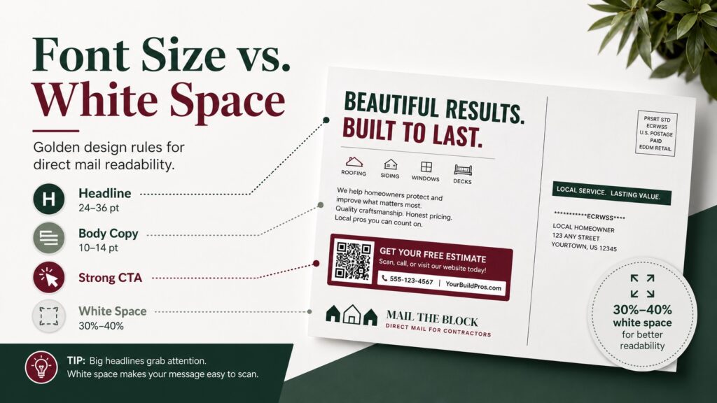
The best direct mail postcard design uses a clear visual hierarchy: a bold 24pt to 36pt headline, 10pt to 14pt supporting copy, a dominant CTA, and enough white space to keep the offer easy to scan. A strong mailpiece layout template should reserve open space around the headline, QR code, phone number, address block, indicia, and postal processing areas.
2026 Direct Mail Readability Matrix
| Design Element | Recommended Rule | Why It Matters |
|---|---|---|
| Main headline | 24pt to 36pt bold font | Readable from arm’s length |
| Body copy | 10pt to 14pt | Keeps details clear without clutter |
| CTA or phone number | Larger than body copy, high contrast | Guides the next action instantly |
| White space | 30% to 40% uncrowded layout | Improves scanning and focus |
| QR code area | Clear space around code | Helps mobile scanning |
| Mailing panel | Keep address, indicia, and postal areas clean | Reduces layout compliance risk |
The 3-Second Filter: Why Crowded Postcards Land in the Trash
A homeowner does not study a postcard like a brochure. The card usually gets judged during the walk from the mailbox to the kitchen counter. If the main offer is not clear within three seconds, the piece is likely to get ignored.
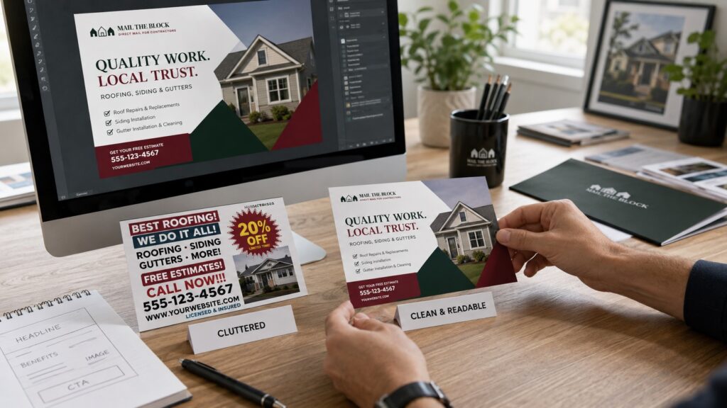
The biggest mistake in direct mail postcard design is trying to say everything at once. Contractors often want to list every service, every credential, every town served, every license detail, and a full company history on one side of the card. That creates visual exhaustion.
A better direct response design rule is simple: one audience, one problem, one offer, one action.
For contractors using Mail The Block’s EDDM service or direct mail postcards, readability should be treated like a conversion tool, not a decoration choice.
Sizing Your Hierarchy: The Golden Typography Rules
Typography should tell the eye what matters first.
The Headline
Use a bold, clean headline that can be read at arm’s length. For most postcard designs, 24pt to 36pt works well for the main header.
Examples:
Did the Storm Hit Your Roof?
Spring Clean-Up Slots Are Filling Fast
Protect Your AC Before the First Heatwave
Avoid thin decorative fonts for urgent home service advertising. They may look stylish, but they often fail in real mailbox conditions.
Body Copy and Bullet Points
Supporting copy should usually stay between 10pt and 14pt. That is enough for clean readability without letting the details overpower the offer.
Use bullets instead of paragraphs:
- Same-week appointments
- Licensed and insured crews
- QR code scheduling
- Local neighborhood routes
The Call to Action
The phone number, QR code, or tracking URL must be one of the largest elements on the card. If the CTA hides in the corner, response drops.
Use high contrast: dark green on white, white on burgundy, or black on light backgrounds. Never place a phone number over a busy photo unless a solid overlay or clean box protects the text.
The Power of the Void: Utilizing White Space to Direct the Eye
White space is not wasted space. It is how the design tells the homeowner where to look.
A strong mailpiece layout template should leave 30% to 40% of the card uncrowded. This does not mean the design should look empty. It means the headline, offer, image, QR code, and phone number each need breathing room.
White space helps:
- Separate the headline from the offer
- Make the CTA easier to find
- Improve QR code scanning
- Keep the address panel clean
- Make the brand feel more premium
- Reduce visual noise around the core message
For home service contractors in Hartford, Bristol, Southington, Farmington, Plainville, and nearby Connecticut towns, clean design can make a small local campaign feel more trustworthy than a cluttered coupon sheet.
USPS Legal Clearances: Designing Around the Barcode Zones
A beautiful postcard still needs to survive postal processing. EDDM layouts must protect the mailing side, including the address block, indicia, and processing areas.
For EDDM Retail, the indicia belongs above and to the right of the address block. The simplified address should read “Postal Customer” or “Local Postal Customer.” Designers should not crowd that area with coupons, QR codes, photos, or heavy textures.
As a practical template guardrail, reserve a clean bottom processing strip, commonly planned around 0.75″ x 10.5″ on larger postcard layouts, plus a clean address and indicia panel. This conservative space helps keep barcode, sorting, and postal markings away from critical design elements.
Before printing, check:
- The address block has clean contrast.
- The EDDM indicia is visible and unobstructed.
- The QR code is not inside the postal panel.
- The bottom processing strip is not packed with offer text.
- The CTA is separate from USPS-required areas.
- The final trim size matches the approved mailpiece format.
Launch a High-Readability Direct Mail Campaign
An exceptional direct mail campaign requires striking copy and smart layout structure. Do not let a cluttered, unreadable design weaken local response rates.
Mail The Block combines direct-response design, neighborhood targeting, EDDM setup, and print production so contractor postcards command attention the moment they hit the doorstep. Explore pricing, view campaign examples, or contact Mail The Block to launch a high-readability direct mail campaign.